Дизайн
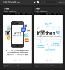
Capptivate.co
Capptivate.co captures fleeting transitions between app screens and delightful animated UI elements that we’ll otherwise lose forever as apps and operating systems continue to evolve.

Capptivate.co
Capptivate.co captures fleeting transitions between app screens and delightful animated UI elements that we’ll otherwise lose forever as apps and operating systems continue to evolve.

Справочник фронт-энд девелопера: виды горизонтальных панелей навигации
Данная статья нацелена скорее на начинающих верстальщиков, но, может быть, матерые профессионалы тоже найдут в ней что-то новое или будут обращаться к ней как к справочнику.

Справочник фронт-энд девелопера: виды горизонтальных панелей навигации
Данная статья нацелена скорее на начинающих верстальщиков, но, может быть, матерые профессионалы тоже найдут в ней что-то новое или будут обращаться к ней как к справочнику.
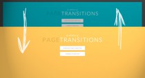
A Collection of Page Transitions
A showcase collection of various page transition effects using CSS animations.

Fullscreen Layout with Page Transitions
A simple responsive layout with some fancy page transitions. The idea is to show four items initially and expand them. Some additional page transitions are added for inner items.

Fullscreen Layout with Page Transitions
A simple responsive layout with some fancy page transitions. The idea is to show four items initially and expand them. Some additional page transitions are added for inner items.
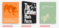
3D Book Showcase
An experiment about a realistic looking book showcase with some interactivity using CSS 3D transforms.

3D Book Showcase
An experiment about a realistic looking book showcase with some interactivity using CSS 3D transforms.
Pixel-free CSS
I recently redesigned my blog, The Sunday Best. In the process, I think I did something new: I completely avoided the use of px units in my CSS.

SLY
Sly is a JavaScript library for advanced one-directional scrolling with item based navigation support. It can be used as a simple scrollbar replacement, in an advanced item based navigations, or as a great navigation and animation interface for parallax websites.

SLY
Sly is a JavaScript library for advanced one-directional scrolling with item based navigation support. It can be used as a simple scrollbar replacement, in an advanced item based navigations, or as a great navigation and animation interface for parallax websites.


