Pixel-free CSS
|
I recently redesigned my blog, The Sunday Best. In the process, I think I did something new: I completely avoided the use of px units in my CSS. I’ve been (badly) making websites since I was 14. In 1996, and indeed for most of the Web’s existence, makers of websites had to be very concerned about the average resolution of users’ screens. I felt safe stretching my sites to just under 800-pixels wide to avoid horizontal scroll bars on monitors in the late ‘90s. By the early ‘00s, it was safe to make websites just under 1024-pixels wide. In 2013, however, it’s more complicated. Uber users run Thunderbolt displays stretching 2560 pixels. Those same users are also on Macbook Airs with just 1366 pixels. Or on iPhones, with a width of 640 pixels but which answer to media quieries for 320-pixel design. In 2013, the pixel is nearly meaningless. I got tired of guessing users’ pixel counts. I fully adopted vw and em units in my CSS. It started when I discovered vw units, and learned that I could define a font size in them. My initial goal was to simply resize the font based on the width of the viewport — and it worked, at least in modern browsers. body { font-size: 1.8vw; }
I then wanted to see how far I could take the idea. I ended up completely removing px units from my CSS. And I’m very happy with the results. The final challenge in extricating pixels from my design came from social share buttons. While the rest of my page fitted perfectly to any size screen, share buttons such as Facebook’s Like didn’t resize the same way. In mobile Safari, the button was uselessly tiny. Twitter offers different sizes for the Tweet button, but Facebook surprisingly has no options. In the end, I nixed the standard share buttons and created my own. (They’re not quite as functional as stock buttons, but certainly more usable on mobile, and more attractive.) The benefitsResponsiveness is built in. Sort of. I still use media queries to adjust the layout for portrait screens and small screens. Everything is kept to scale. Font size doesn’t adjust independently of the column width — roughly the same character count per line is retained. Dividing lines are sized relative everything else, maintaining the original proportions no matter what. Users can resize a browser window to any size or aspect ratio and the design will fit — no horizontal scroll bars, no obstructed content. Instead of keeping a rigid browser size, this allows users to move the content anywhere on a desktop. There’s no unused blank space around the page, no wasted screen. It’s not easy for most people to do, but users can load multiple sites within a set of adjacent iframes, effectively viewing multiple websites at once. (Assuming other sites are as flexibly designed. Here’s an example — naturally, it works with most responsive designs.) The drawbacksBrowser zoom controls no longer do anything on my blog — the only way to increase or decrease the size of the text is to resize the browser window. I haven’t yet established a style for very large browsers, so at high resolution and a full-screen window the design gets a bit silly. I had to give up stock social share buttons. They’re ugly anyway. Images are still in pixels, and they get stretched. I don’t use many images in the page design, but do use a lot of photos. I’m pretty happy with how resized photos look in modern browsers. (Vector graphics and more advanced image serving could negate this issue.) Browser compatibility with vw and vh units is still an issue. They work great in WebKit and Gecko. I looked at my blog in Internet Explorer just once and it seemed usable, though there were certainly some issues. I have the luxury of not having to worry about Internet Explorer. Most of the Web isn’t built like this, which means some of the ideals behind it don’t really work. Users aren’t accustomed to resizing their browser window to squeeze content to a preferred size. Some users always run full-screen even on large resolutions, which makes my blog look silly (words get huge). And few users are in the habit of loading multiple websites in adjacent iframes — we use tabs instead, which are generally preferable anyway (but don’t have the same options for content consumption). I think the Web should fully move in this direction. True proportionate sizing seems to me a more authentic way to responsively fit websites to browsers (rather than media queries that simply toggle between set pixel widths). It’s also pretty easy, and requires virtually zero guessing about the user’s browser. And after jumping the initial mental hurdle of designing in vw instead of px, I found it much easier and faster to build. |
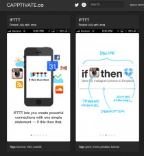
Capptivate.co
Capptivate.co captures fleeting transitions between app screens and delightful animated UI elements that we’ll otherwise lose forever as apps and operating systems continue to evolve.
Capptivate.co
Capptivate.co captures fleeting transitions between app screens and delightful animated UI elements that we’ll otherwise lose forever as apps and operating systems continue to evolve.
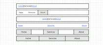
Справочник фронт-энд девелопера: виды горизонтальных панелей навигации
Данная статья нацелена скорее на начинающих верстальщиков, но, может быть, матерые профессионалы тоже найдут в ней что-то новое или будут обращаться к ней как к справочнику.
Справочник фронт-энд девелопера: виды горизонтальных панелей навигации
Данная статья нацелена скорее на начинающих верстальщиков, но, может быть, матерые профессионалы тоже найдут в ней что-то новое или будут обращаться к ней как к справочнику.
Ещё один способ устранить ВОШ
ВОШ — эффект, возникающий при стилизации текста подключаемым шрифтом, не установленным на компьютере пользователя. Проявляется, когда подключаемый шрифт ещё не успел скачаться, и стилизуемый текст отображается следующим шрифтом из значения свойства font-family этого элемента. Такое переключение шрифтов также может повлиять на размеры элемента, если они зависят от размеров текста в нём.
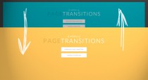
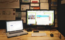
A Collection of Page Transitions
A showcase collection of various page transition effects using CSS animations.
A Collection of Page Transitions
A showcase collection of various page transition effects using CSS animations.
Fullscreen Layout with Page Transitions
A simple responsive layout with some fancy page transitions. The idea is to show four items initially and expand them. Some additional page transitions are added for inner items.
Fullscreen Layout with Page Transitions
A simple responsive layout with some fancy page transitions. The idea is to show four items initially and expand them. Some additional page transitions are added for inner items.
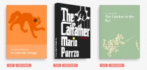
3D Book Showcase
An experiment about a realistic looking book showcase with some interactivity using CSS 3D transforms.
3D Book Showcase
An experiment about a realistic looking book showcase with some interactivity using CSS 3D transforms.
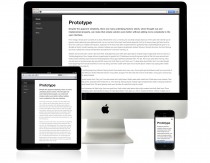
Responsive Nav
Responsive navigation plugin without library dependencies and with fast touch screen support. Try it out by resizing this window.
Responsive Nav
Responsive navigation plugin without library dependencies and with fast touch screen support. Try it out by resizing this window.

Повторяющийся зубчатый фон на CSS
Зубчатый фон используя только средства CSS и никаких изображений