Responsive Tables with inner scrolling
|
When we looked around at the various implementations of responsive tables on the web, we saw lots of interesting ideas but nothing we thought was a really great implementation. Chris Coyier on css-tricks.net did a great round up of responsive data tables and while there’s some fascinating ideas in there, nothing seemed to meet the criteria we had for a great implementation:
With those existing tricks in mind, we set out to develop this, a CSS/JS combo that takes existing tables and modifies them for small devices so they meet our criteria. It works by taking the first column and «pinning» it to the left of the table, allowing you to scroll the other columns under it. You don’t lose the likely key for each row, but you also don’t have to break your nice responsive layout. We built these specifically to work with Foundation, our open source front-end framework for responsive sites, but it would work just fine with any responsive site.
|

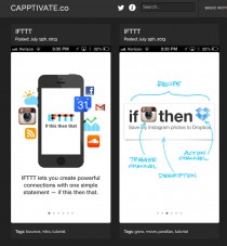
Capptivate.co
Capptivate.co captures fleeting transitions between app screens and delightful animated UI elements that we’ll otherwise lose forever as apps and operating systems continue to evolve.
Capptivate.co
Capptivate.co captures fleeting transitions between app screens and delightful animated UI elements that we’ll otherwise lose forever as apps and operating systems continue to evolve.
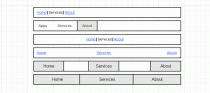
Справочник фронт-энд девелопера: виды горизонтальных панелей навигации
Данная статья нацелена скорее на начинающих верстальщиков, но, может быть, матерые профессионалы тоже найдут в ней что-то новое или будут обращаться к ней как к справочнику.
Справочник фронт-энд девелопера: виды горизонтальных панелей навигации
Данная статья нацелена скорее на начинающих верстальщиков, но, может быть, матерые профессионалы тоже найдут в ней что-то новое или будут обращаться к ней как к справочнику.
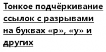
Ещё один способ устранить ВОШ
ВОШ — эффект, возникающий при стилизации текста подключаемым шрифтом, не установленным на компьютере пользователя. Проявляется, когда подключаемый шрифт ещё не успел скачаться, и стилизуемый текст отображается следующим шрифтом из значения свойства font-family этого элемента. Такое переключение шрифтов также может повлиять на размеры элемента, если они зависят от размеров текста в нём.
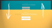
A Collection of Page Transitions
A showcase collection of various page transition effects using CSS animations.
A Collection of Page Transitions
A showcase collection of various page transition effects using CSS animations.
Fullscreen Layout with Page Transitions
A simple responsive layout with some fancy page transitions. The idea is to show four items initially and expand them. Some additional page transitions are added for inner items.
Fullscreen Layout with Page Transitions
A simple responsive layout with some fancy page transitions. The idea is to show four items initially and expand them. Some additional page transitions are added for inner items.
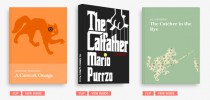
3D Book Showcase
An experiment about a realistic looking book showcase with some interactivity using CSS 3D transforms.
3D Book Showcase
An experiment about a realistic looking book showcase with some interactivity using CSS 3D transforms.
Pixel-free CSS
I recently redesigned my blog, The Sunday Best. In the process, I think I did something new: I completely avoided the use of px units in my CSS.
Responsive Nav
Responsive navigation plugin without library dependencies and with fast touch screen support. Try it out by resizing this window.
Responsive Nav
Responsive navigation plugin without library dependencies and with fast touch screen support. Try it out by resizing this window.